We worked with Rail Modeller to refresh the UI of their OSX app and improve usability
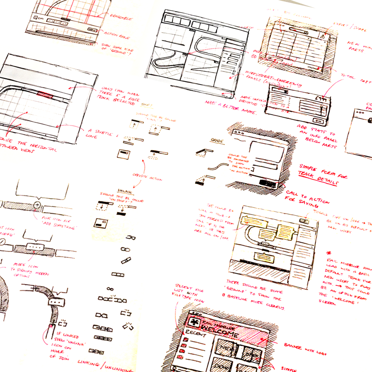
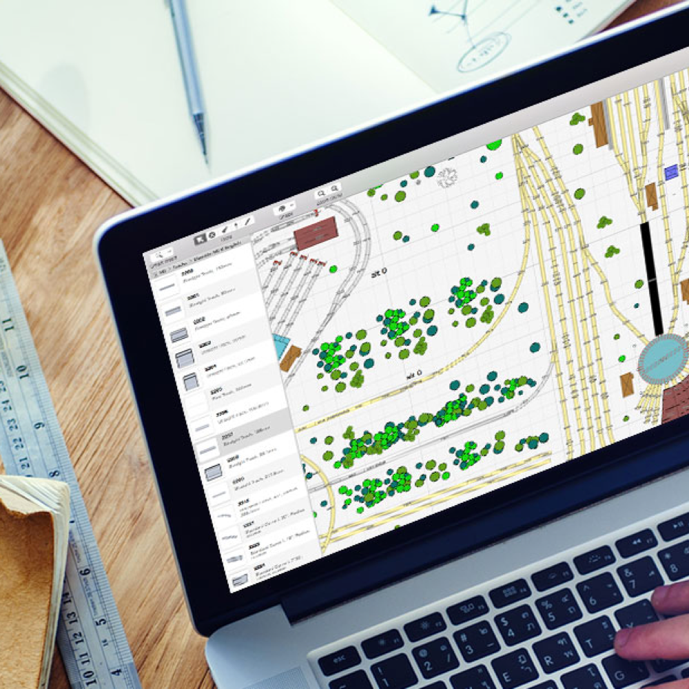
Simplifying Complex Interactions
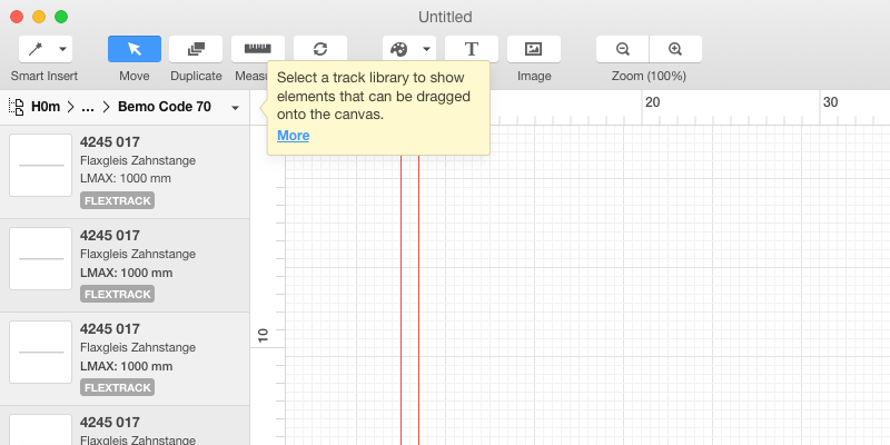
Rail Modeller is a an OSX application and as such doens't have a linear flow. We worked to simplify the interactions required to produce complex interaction. Examples include choosing a part library, picking a track piece and setting a gradient. We split the canvas into an (optional) orthographic view to give context.
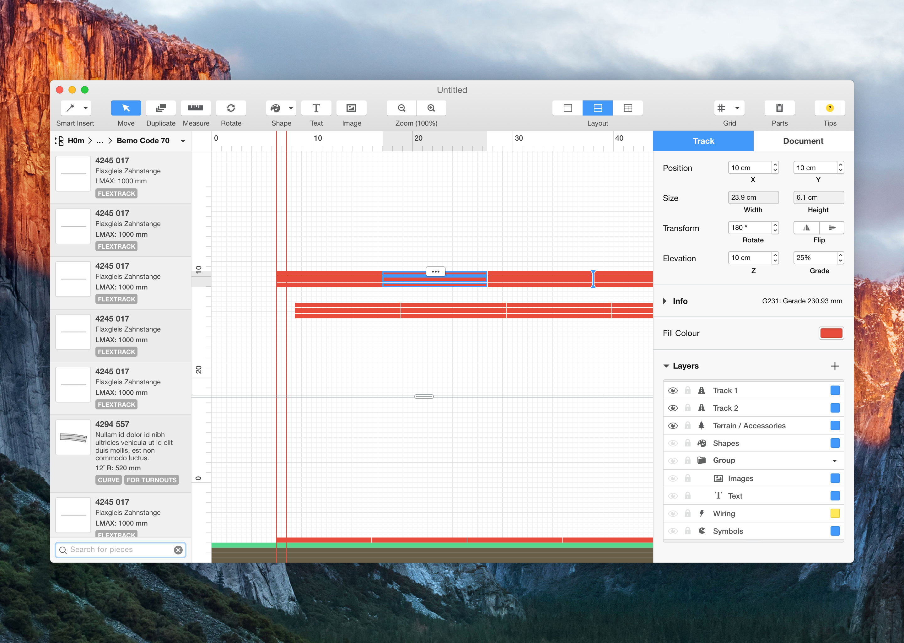
Affordances and Predictability
We introcuced a more consistent menu system with iconography that more clearly indicated the action which it represents. We used graphics programs as the basis as the tasks are fairly similar. We reduced any misinterpresation by introducing tooltips with links to relevant sections in the help.
Reinventing the Inventory
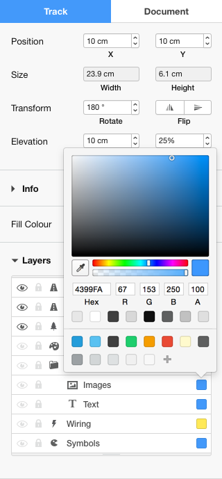
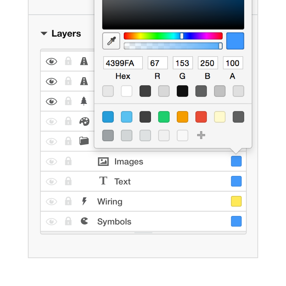
One of the key areas that needed improvement was the inventory; the area where users can view the pieces they have used while building.
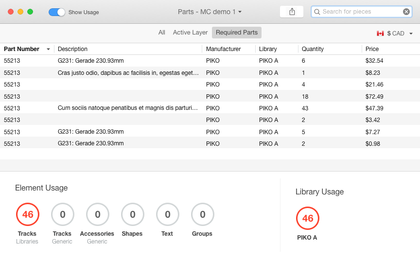
We made it simple and straight-forward to toggle between specific information about the canvas as well as give users the ability to create a shopping list and export using conventional OSX interface elements. The goal was always to make the application more accessible to non-technical people.
We are not accepting any new projects right now
We love working with with passionate teams to build amazing products. Get in touch with a little information about what you're working on and let's discuss how we can help you achieve your digital goals.